Blast from the past: Looking back to early 2012 at Circa News 1.0 pre-launch

I was rummaging around in some old files today when I came across the original pitch decks for Circa. One in particular was a trip down memory lane: the deck that we put together showing how the app worked for our investors. The deck was dated July 2012, and it would precede our launch by about 3 months. Ultimately you’ll need to have some familiarity with what Circa was to really understand some of this. A few of the things depicted here in the app design actually never made it into the app, and I’ll explain a bit about that as we go on. But without further ado:
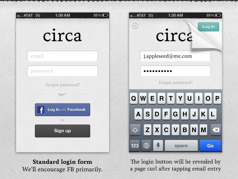
We were sort of obsessed with this page curl look, so it stuck.
One interesting little tidbit…I was really looking for an authentic newspaper page edge look so we actually snagged a San Francisco Chronicle, scanned it in, then made vectors out of that. While the skeuomorphic design was pretty heavy there, it was a nice little subtle detail for that time.
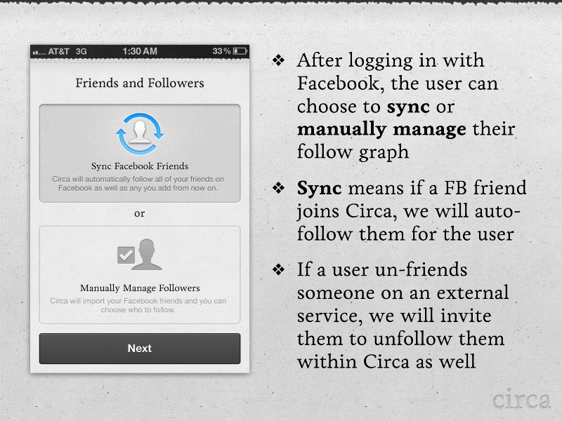
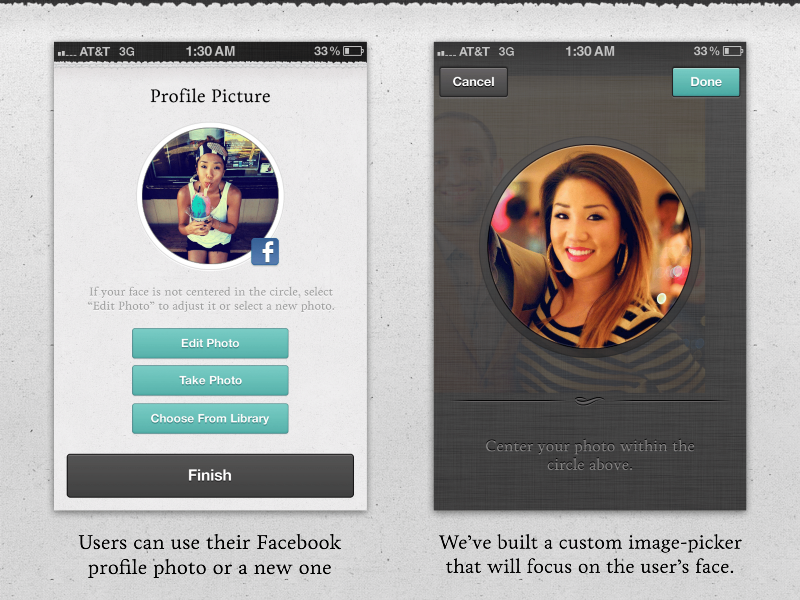
This was something we thought a whole lot about. Circa actually had a social network behind it originally…of followers and people you’d follow. But we also knew that would add some complexity that could be annoying if you didn’t want yet another social network. So we came up with this method of keeping friends in “Sync” so any new friend that ever joined the service would be auto-followed from sign-up on.
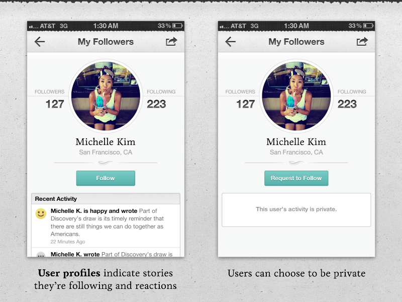
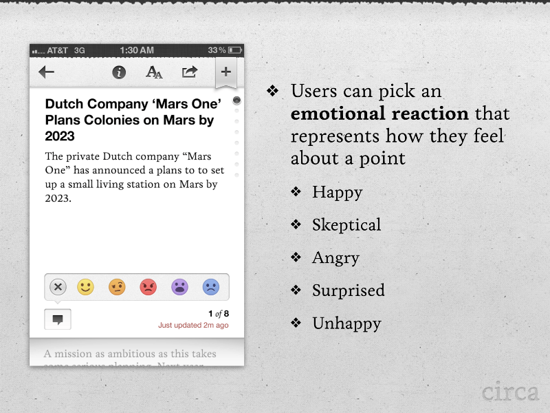
User profiles would show off what news people cared about, and what they’d “reacted” to…more on that later.
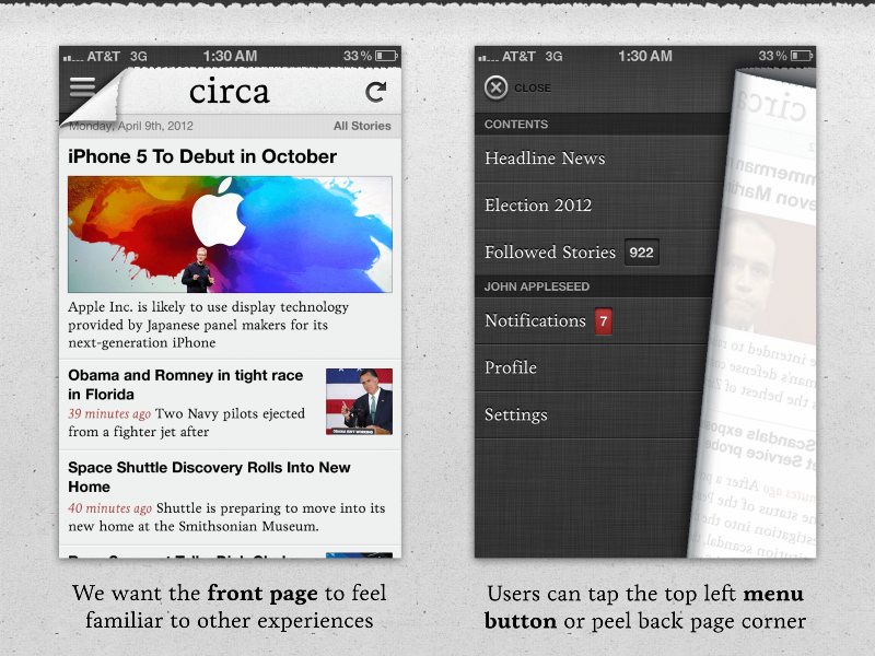
The upper left corner being peeled back turned out to be an INCREDIBLE pain to get just right. We were using off-the-book APIs to make it happen originally, but when we got closer to submission to the App Store we realized it wasn’t going to be a viable solution. The design that we launched with was pretty close to this, but it ultimately differened a bit.
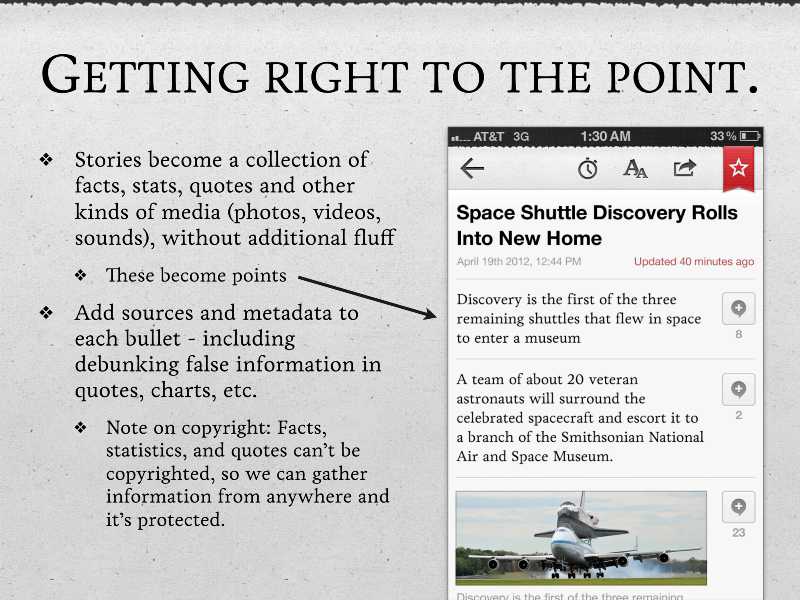
Note that in the beginning we were only going to cover two categories of news: Headline News and Politics, specifically the 2012 Presidential Election.
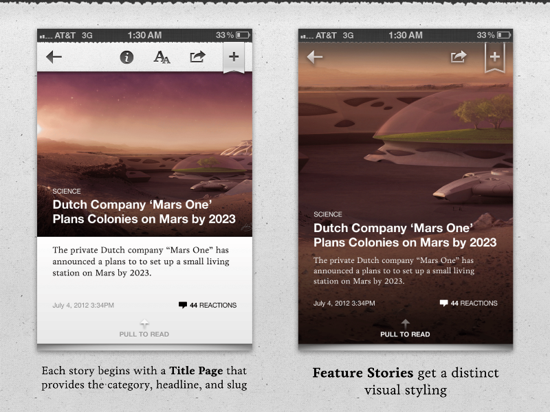
We LOVED the “Feature Story” visuals. The only trouble was that over time we kept having a tough time finding the perfect images to line up with the other chrome well. Between the portrait orientation, and text overlay, it was just too tough to manage and we eventually abandoned them.
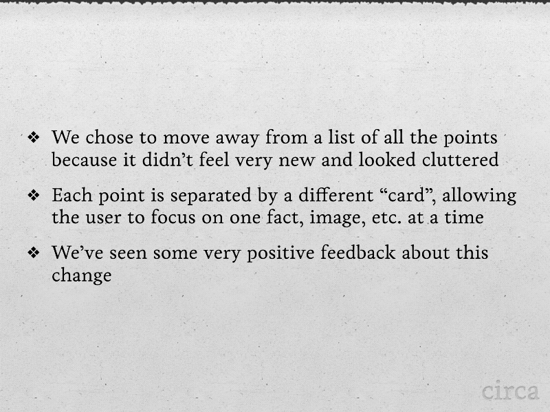
Note that this slide references “a list of all the points.” Turns out before we came up with the page-snapping mechanism all the points used to be on just one page. Here’s what that would have looked like (Note this was a different pitch deck, dated March 2012):
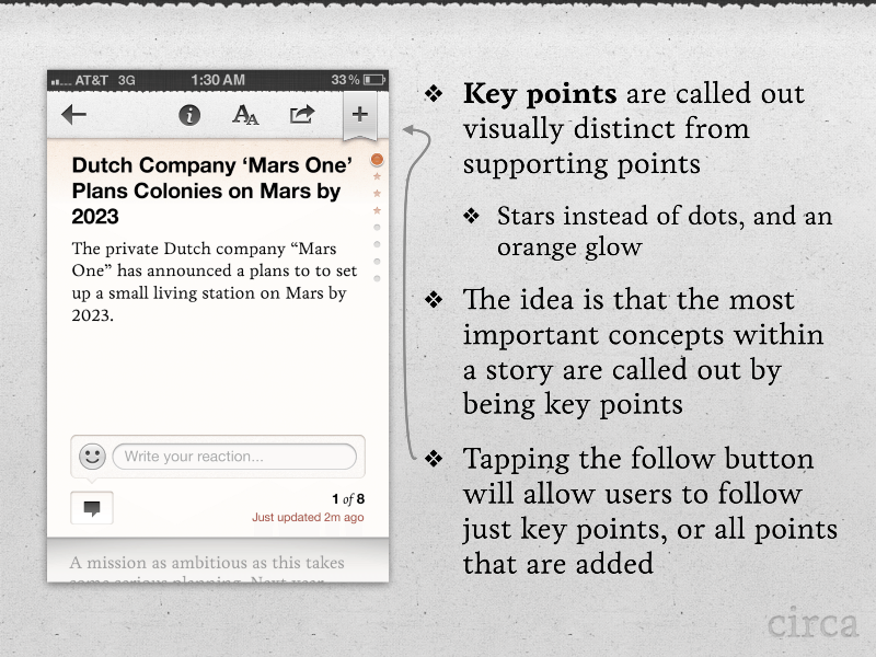
Originally we thought that stories would have “key points” and just normal points. Users could follow just the key points, or follow all the points that were added to a story later on. This turned out to be an extra level of complexity for both the user and the editor and was ultimately canned because it was just not that necessary. But that gold gradient though…
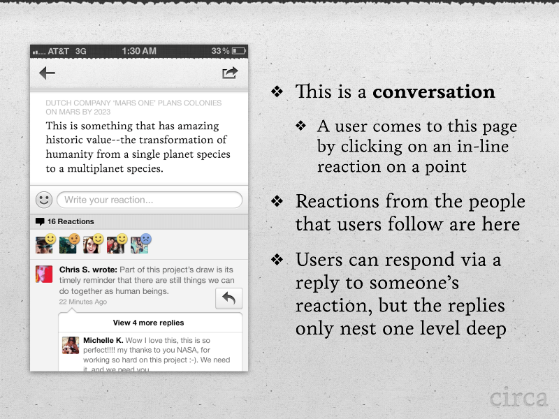
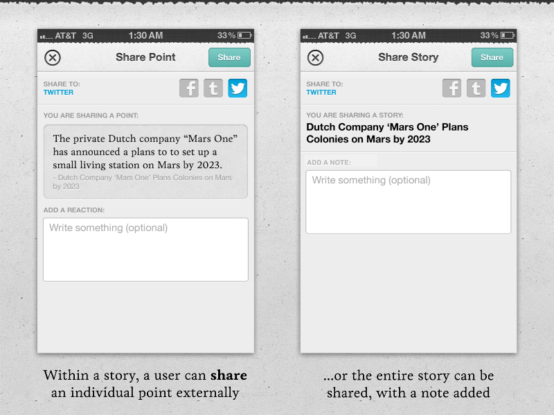
And here’s one feature that Circa never ended up seeing: social interaction.
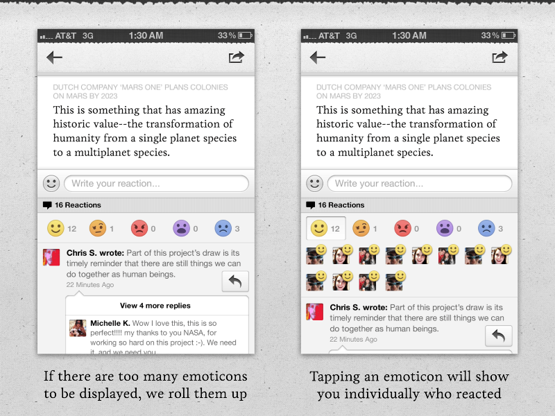
Most people may be surprised to know that this was actually built and implemented into Circa News 1.0, and we were actively testing it even weeks before the app launched in the App Store in October 2012. A reaction could be added to every point in the story, not just the story overall. As you scrolled the story you’d be able to see how your friends were reacting to the news.
You’ll notice that the reactions look quite similar to Facebook’s version that launched a little while ago. That’s pure coincidence, though these were very much inspired by Path’s reactions as well.
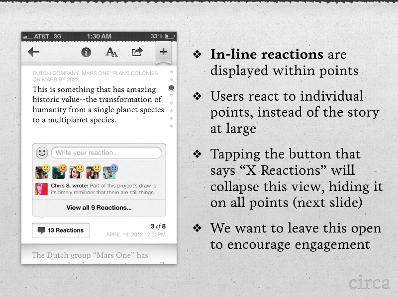
Honestly we really liked the in-line reactions. It made the news feel pretty alive, and allowed for a granularity of commentary that didn’t really exist in other news products. At the end of the day though, it added a level of complexity to a product that already had a bunch of new ideas in it, and we ended up walking back from implementing reactions.
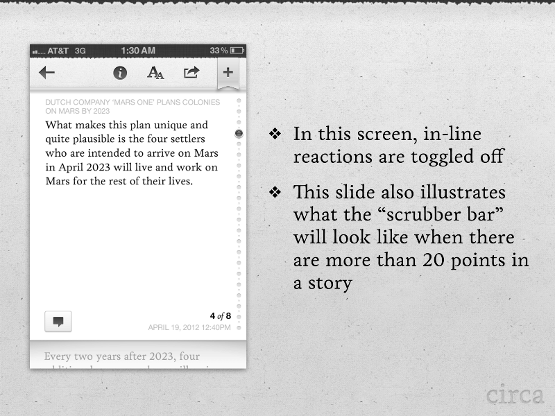
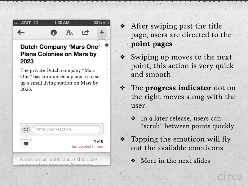
We had a design for the “scrubber bar” when stories went past 20 points. Turns out that very, very rarely happened when writing these stories.
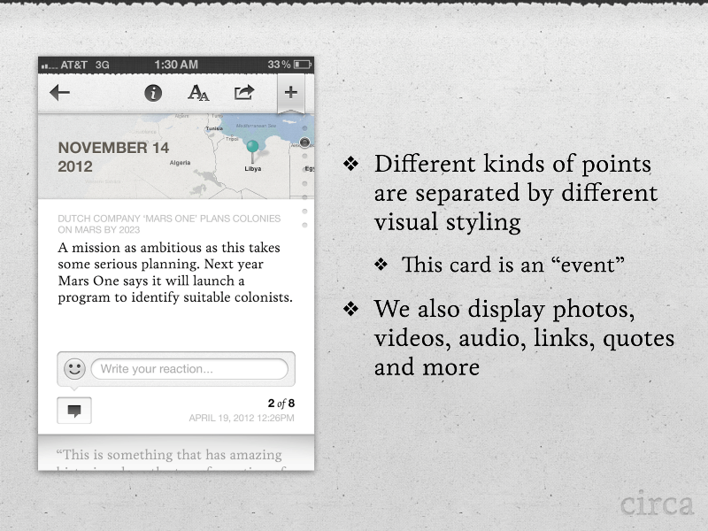
One other detail you’ll notice: the story “slug” was always at the top of the pages. We felt like this helped frame the pages that the user was on, but eventually canned it because it was a bit extraneous and took up room.
We’d also number the points that were in the story. It was a nice design.
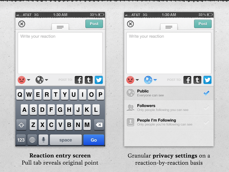
See? Reactions got super granular. The idea behind this was that you’d be able to share your opinions publicly, semi-privately to just followers, or only to people you were following—essentially your friends. Then you’d be able to cross-post these reactions to other networks.
The hope here was that we could become a place to converse about the news—providing plain-spoken, down-the-middle language where the users could add the color.
One other thing: the pull tab up top would mean that you could swipe back and see what the original point was without losing your place on your text.
Here’s one thing we were super proud of, and was a particular challenge to come up with.
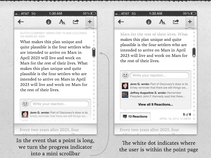
- Stories consisted of individual points that were pages in and of themselves
- Users would swipe through those pages to see the full story, point by point
- Not all points would be exactly the right length to prevent an overflow
So we needed to have a design that accounted for both pagination, and scrolling—something that hadn’t really been done before.
What we came up with was a “scroll within a scroll” — the pages themselves would scroll, until you hit the bottom of it, after which it would just jump to the next one. It felt like a clever design, and actually worked really well (when the code was cooperating). When we presented it to Apple prior to launching they gave us quite a bit of praise for this thing, explaining that it was an entirely new UI element, yet it properly conveyed exactly what it was going to do without any additional thought or help.
This turned out to be an unbelievably big thorn in our side from a code standpoint so it was eventually abandoned entirely. We just couldn’t break from that legacy. I was sad to see it go because it felt so novel, but at the end of the day it just didn’t fit the app anymore in later versions.
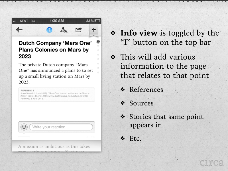
The info button was something I always wanted in there…a way for users to easily see the citations that our editors were adding to the stories.
And that’s it!